Jizera mountains
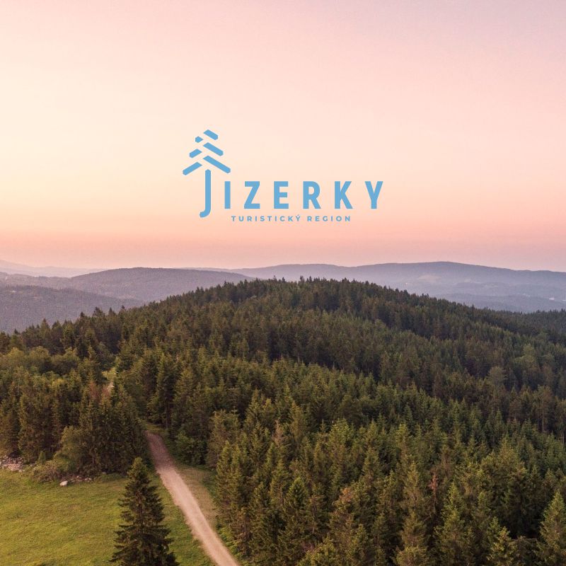
they are about atmosphere. It is not a place about one monopoly entity (Trosky, Sněžka, Pravčická brána), for which lines of tourists are waiting. It is about every stone, rock or tree that together form a whole. The Jizera Mountains have Genius loci in the atmosphere that prevails there when you don't meet anyone. Fog, here and there sunshine, millions of trees, granite rocks as hard as the former life of glassmakers in the mountains and silence. Silence and peace in an overcrowded world is the greatest luxury desired by both a high-ranking manager in Prague and a factory worker in an industrial zone.
Logotype
The basis of the logotype is a tree created from the letter "J". It's no ordinary tree. Its ending suggests that it grows on a rock in harsh conditions like a kneeling. It combines granite rocks and endless forests, the building blocks of Jizera. With its minimalistic ending of the cut, it refers to the tourist signs that show the direction, as well as the website with the project that the logotype protects. Another association that the ending of the letter "J" evokes is an umbrella - a small reference to the typical weather for the region and at the same time background and protection against it. At the same time, spruce is currently the most typical tree species and the name of the highest mountain on the Czech side. The crown of the tree originates from a track typical of cross-country skating and thus originates from a sport typical of the locality.
Identity
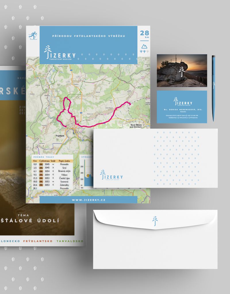
The identity of Jizerek is of a more minimal nature. There are elements that originate topologically from the tree (cone, branch), a divider and navigation elements that also originate from the logotype visually in the style of ending in a hexagon.
There is a significant pattern of cones that maintains the identity in promotional materials and is defined proportionally by a cone spacing of 4 times the cone size in height and width. adjacent rows are shifted horizontally from each other by half the distance between the cones (see picture).
An integral part are large colored rectangular blocks, usually carrying the color of the Brand or the regions, which divide the format into smaller parts and help the content to have order. This modified structure has a better hierarchy for orientation. Typography then forms links and compositions with the blocks.
