
The Crystal Valley brand protects a complete glassworks located in the Liberec Region. It includes entities ranging from small handcraft factories to large glass companies worldwide. Its target group is tourists who come to the Liberec region precisely for the famous Czech glass, and it helps them to get their bearings in the material, and it is an attractive way to take them to authentic productions that are still active.
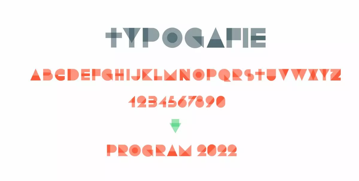
Logotype

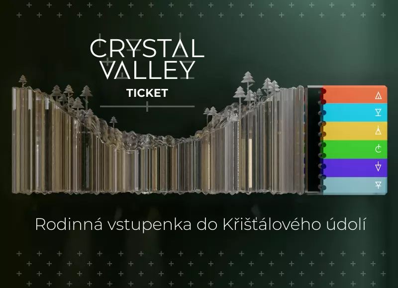
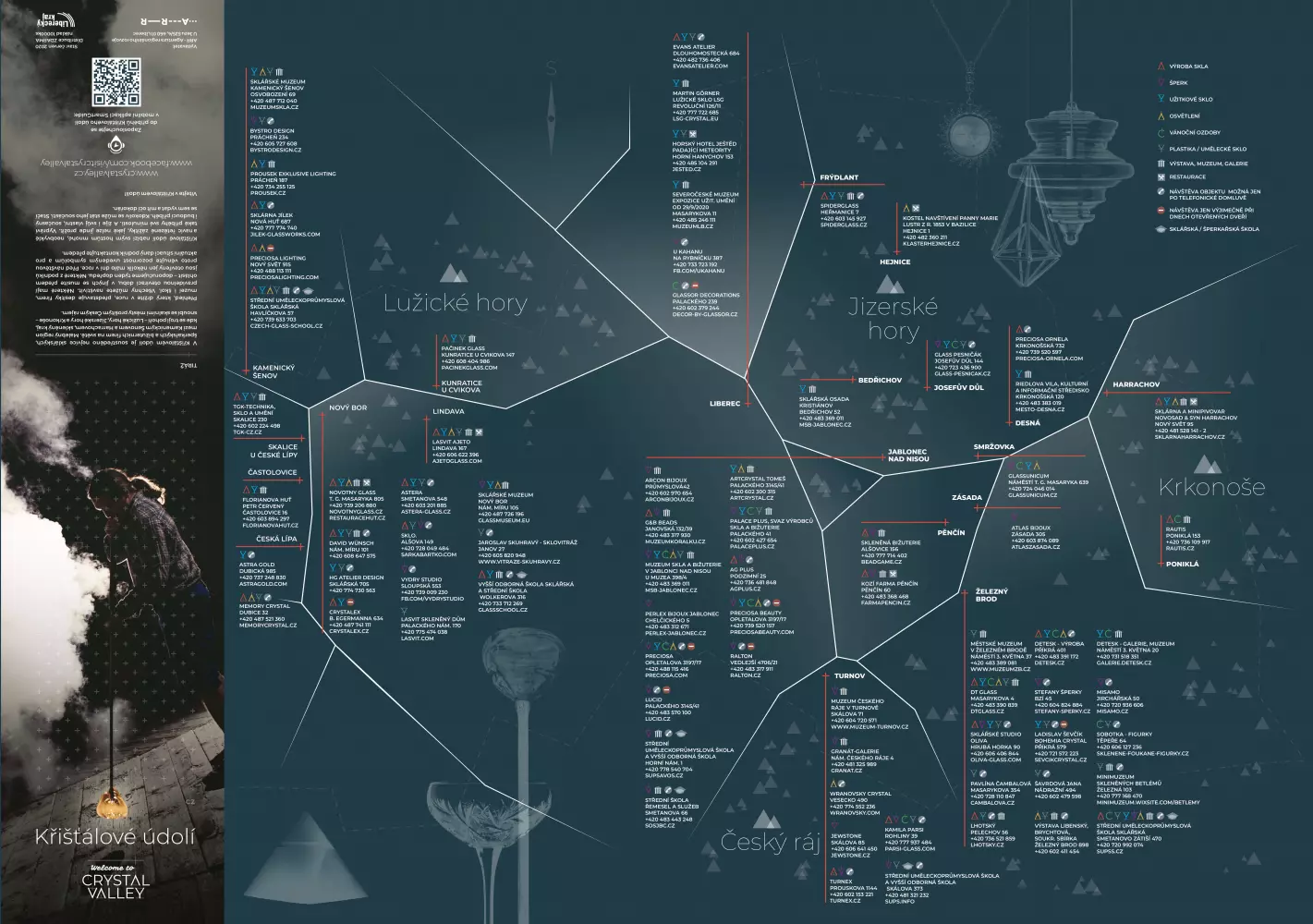
The main issue of the brand is the fact that it must cover the complete diversity of the glass theme in the region. Therefore, we first solved the content, which we divided into 6 subcategories essential for tourism. Production - a tourist-attractive sector where you can see how products are created, and 5 sections that logically divide all products created in the Crystal Valley. Glassware, jewelry, lighting, Christmas decorations and art glass.
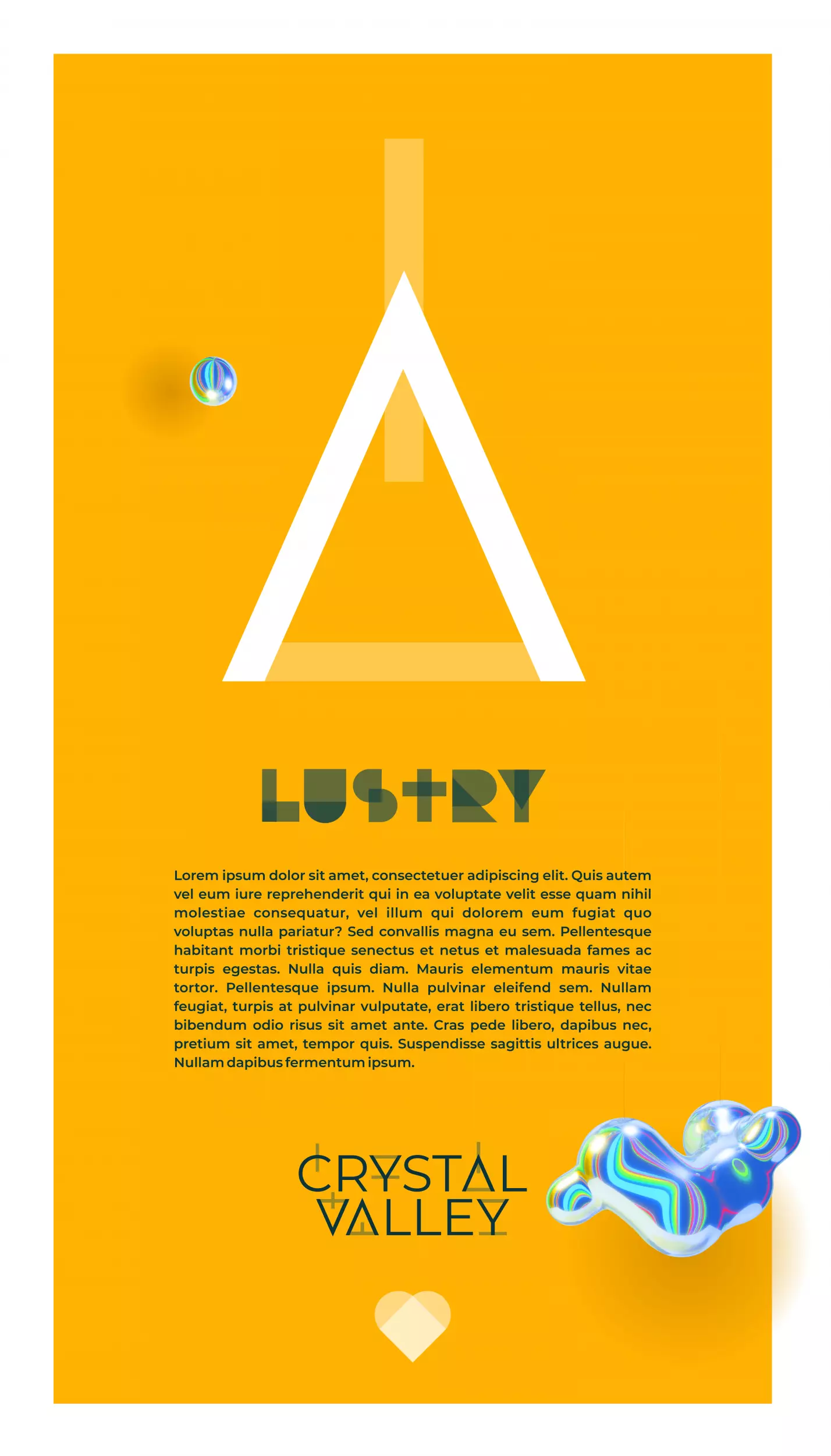
For each section, placeholders-icons are created, which are then further used in the identity for better orientation from printed matter, the web, to the basis of topographic marks for infomaps. The individual symbols are created from the letters CRYSTAL VALLEY, which in turn form the brand logo.


We structure the topic of glass between 6 basic chapters in order to properly present the comprehensive topic of glass in Kříšťálové údolí to visitors. Placeholder icons for topics each have their own significant color as color coding to highlight these chapters.
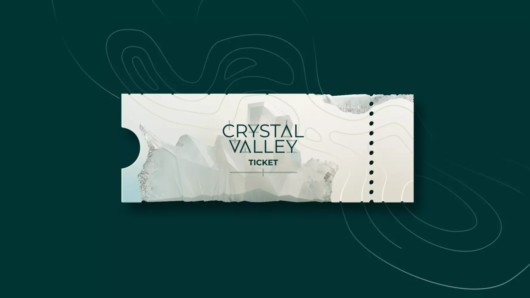
Transparency is a core element of Crystal Valley's identity referring to glass.

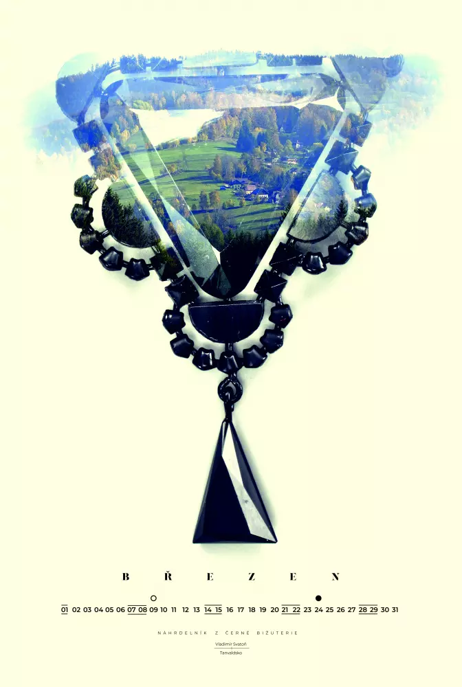
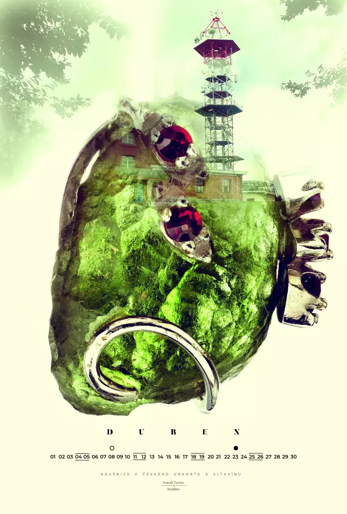
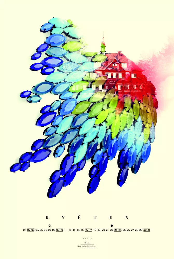
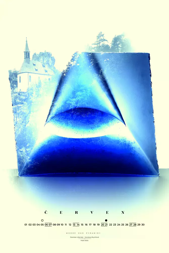
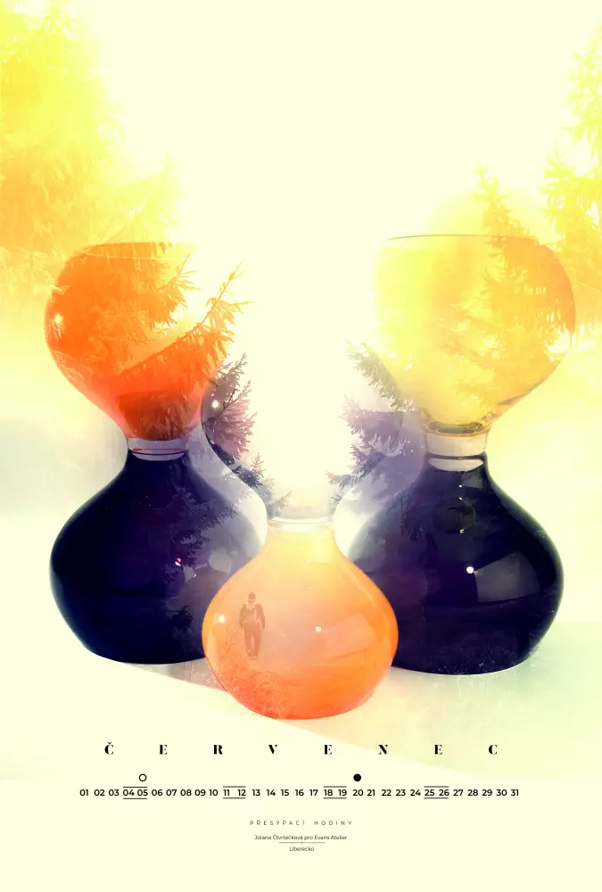
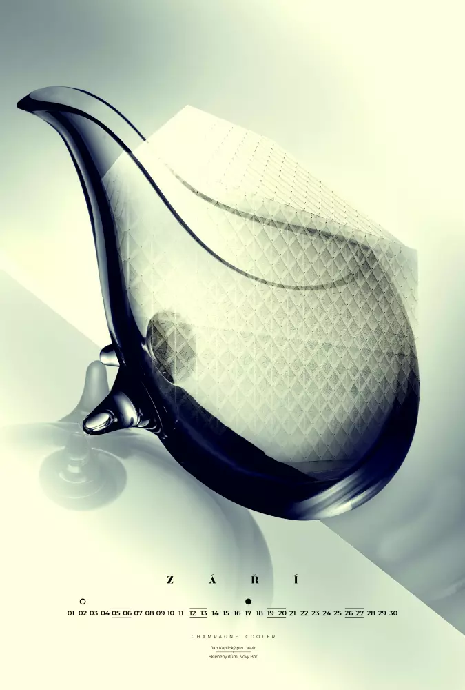
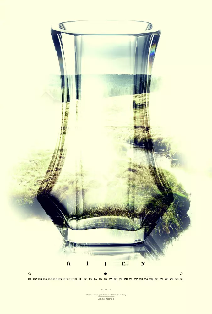
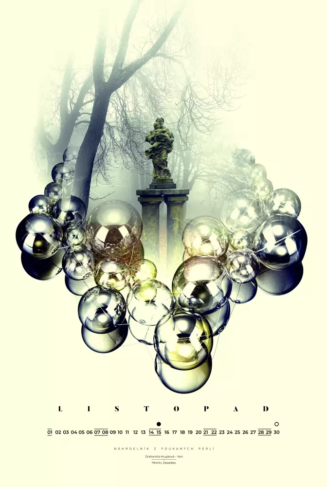
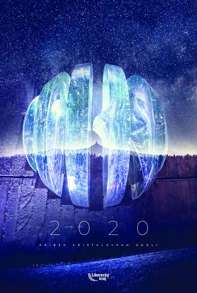
Crystal Valley Calendar


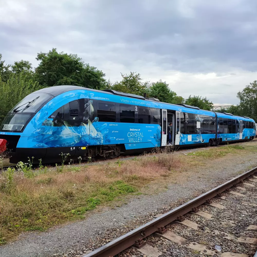
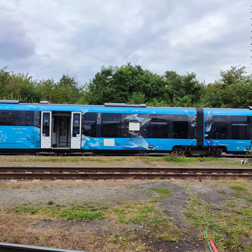
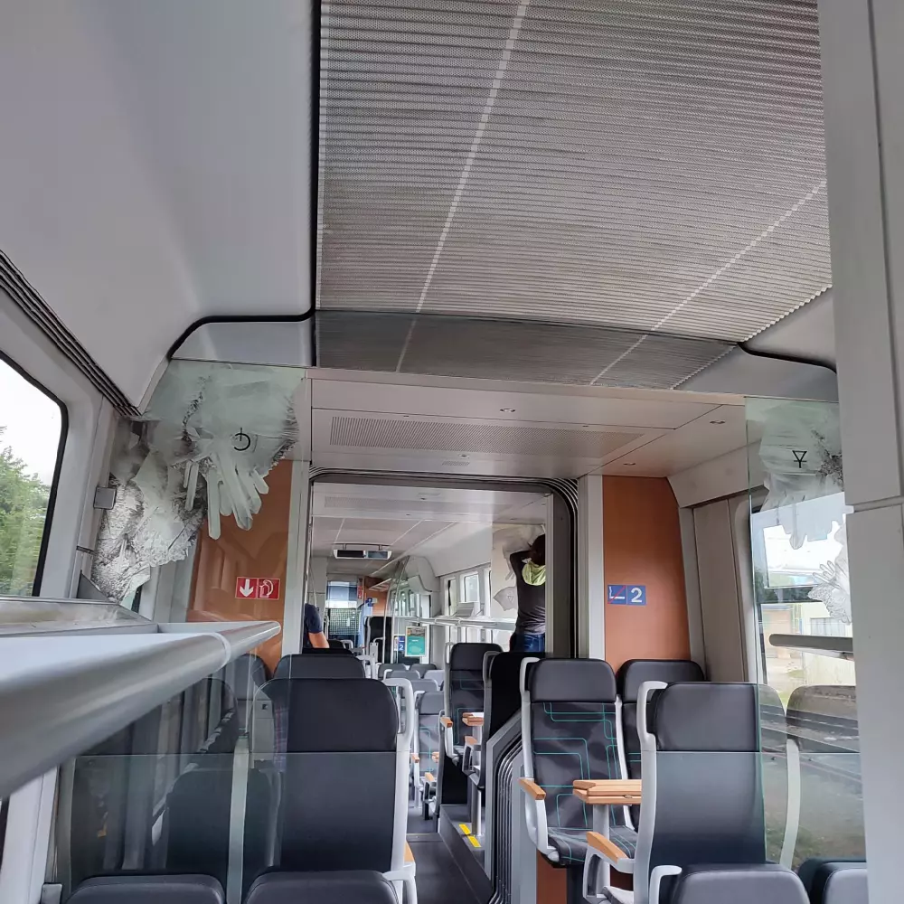
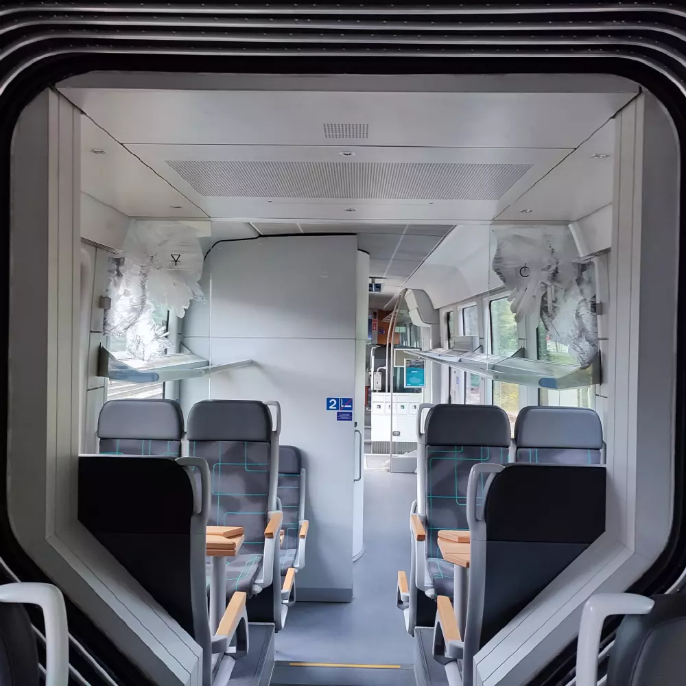
A train representing the valley
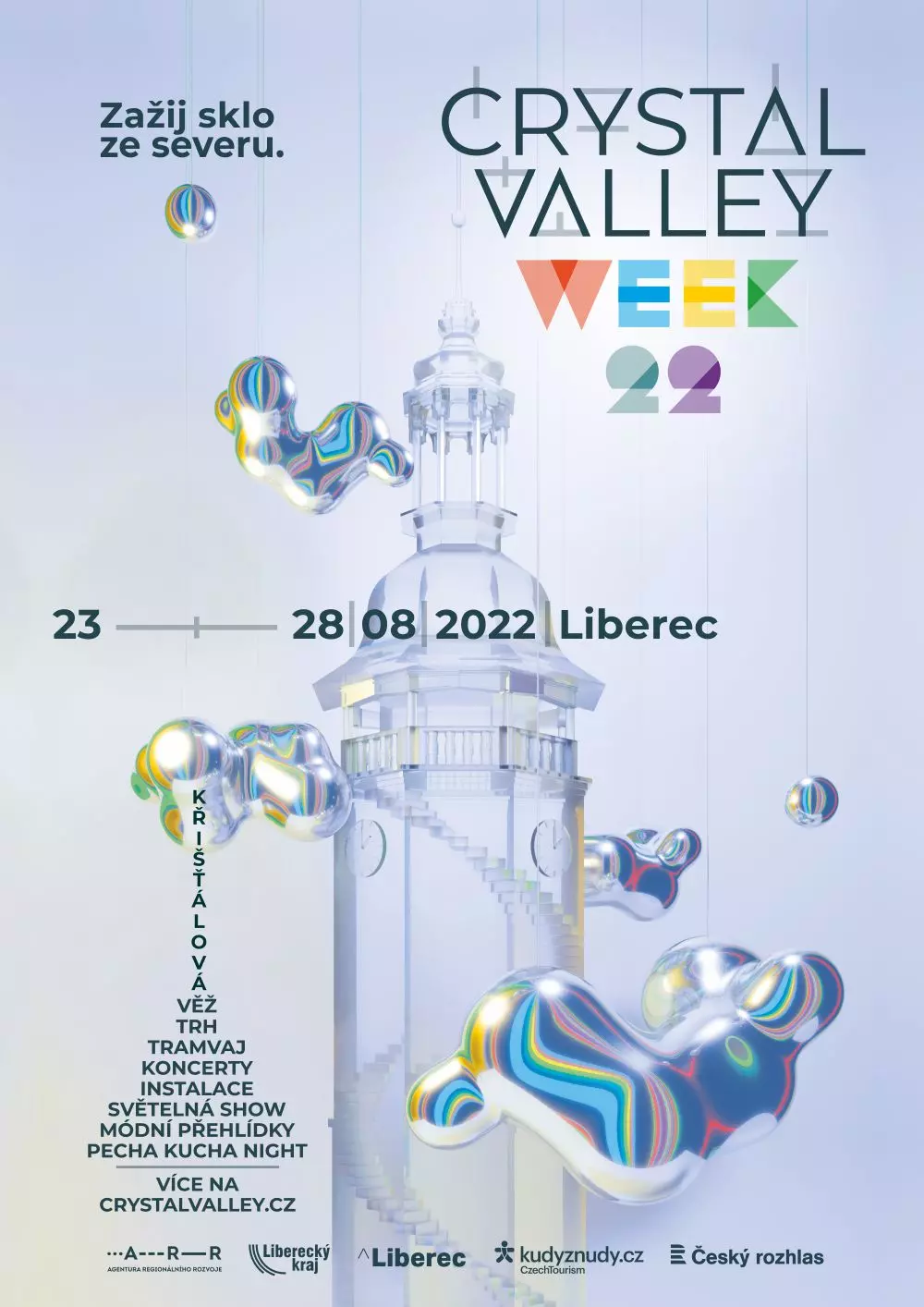
festival crystal valley week

Other materials
David Pastva
Studio Stroy has accompanied Křišťálové údolí from the very beginning in 2019, thus stands behind the overall graphic identity of our project. I particularly appreciate the comprehensive approach not only to graphics, but especially to the development of large projects such as the Crystal Tower or Light on the Tracks.


Other projects


