
The company Narex, which has a long history of producing professional tools in Česká Lípa, asked us to design a new modern identity. The existing logo was already a few years old, so the client was not against a light facelift. For creating an identity, absolutely ideal.

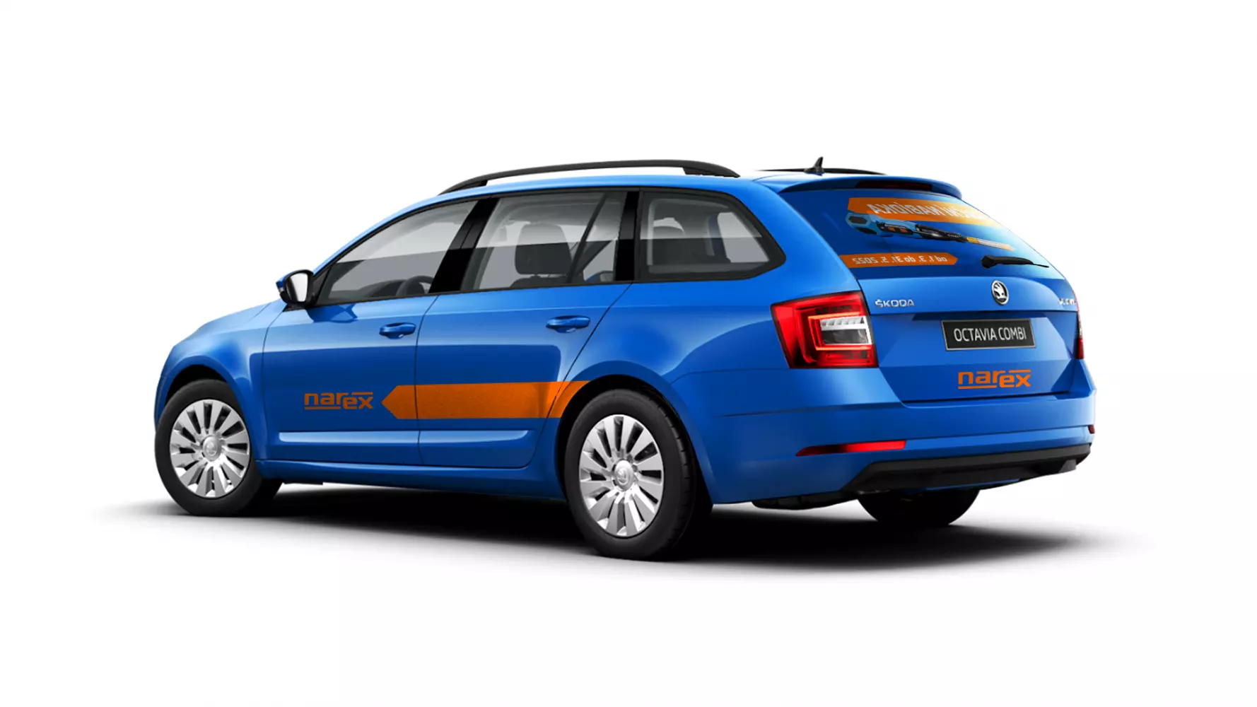
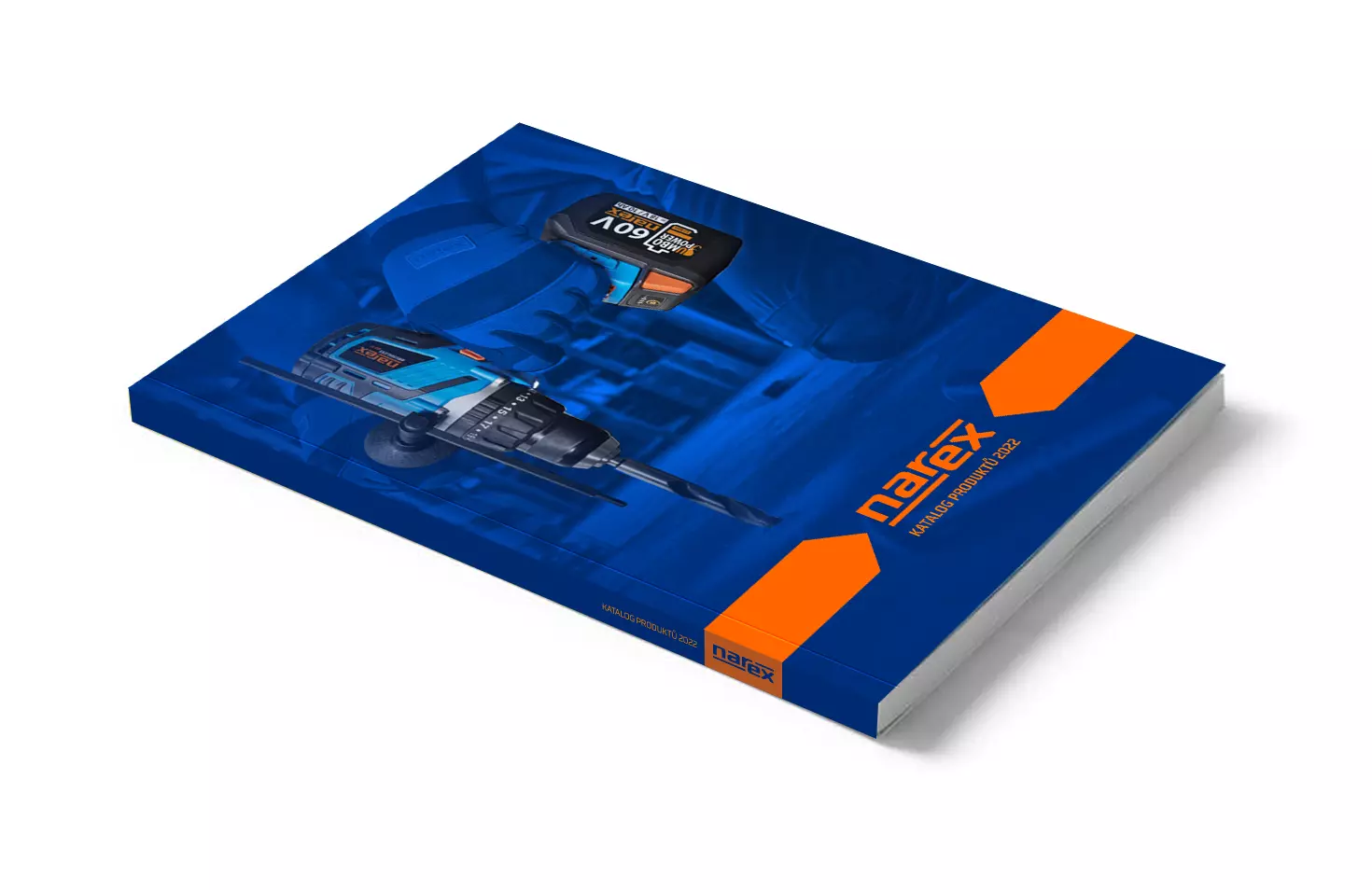
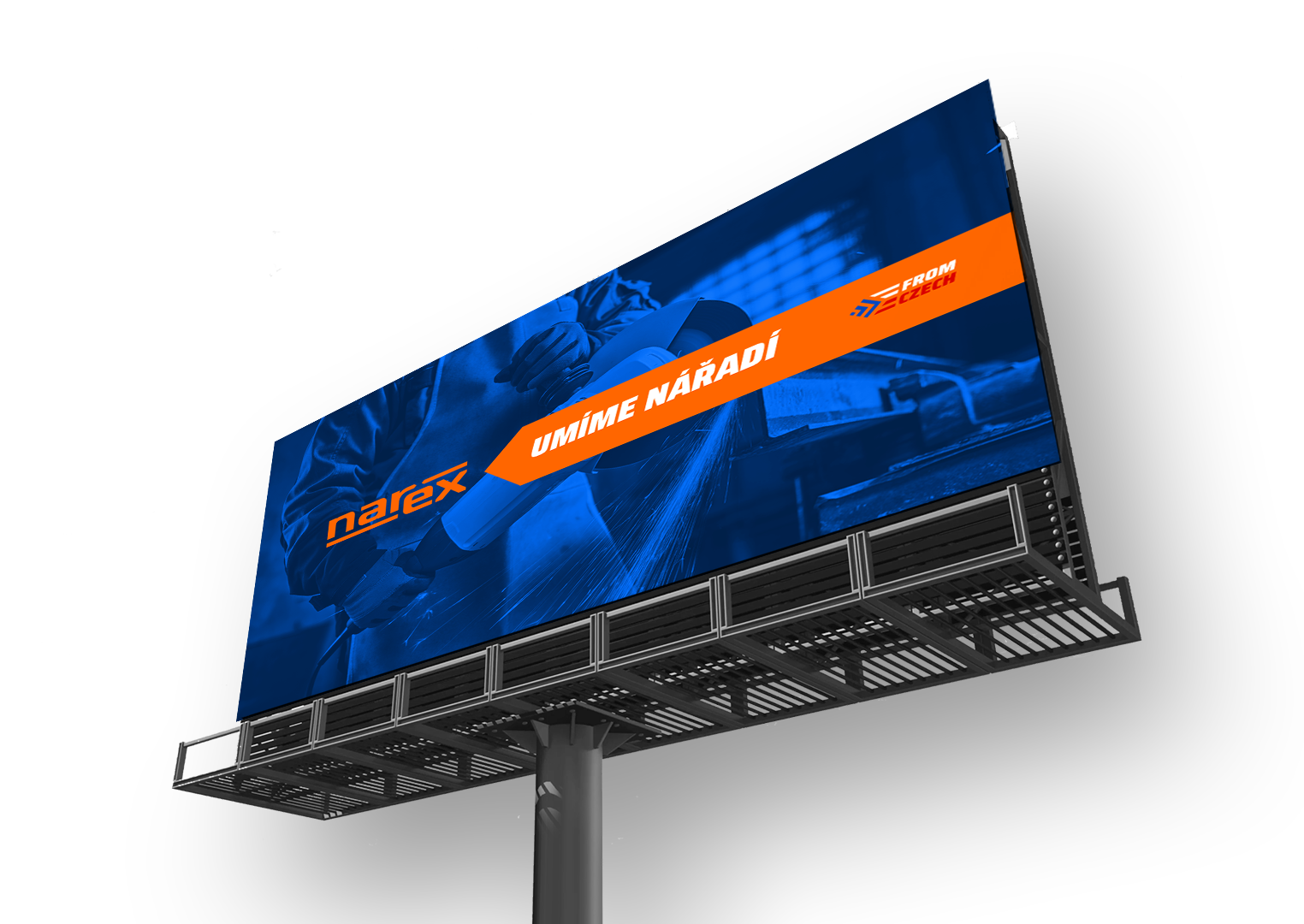
A fundamental change in the logotype was the removal of the frame and the addition of a significant line ending in the shape of an arrow (bit). It is a stylization of one of the most frequently used tools - the drill. The logo thus becomes a brand from a simple inscription and creates a story and a connection between the logotype and the product.
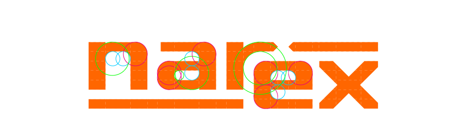
The lettering is modified/rendered using simple geometry with the same rules. The stroke of the font and the size of the spaces is fixed in a uniform coordinate grid. The radii are united so that they are related to each other and ensure a smooth transition between the vertical and horizontal cuts.


petr lukavec
As part of the brand strategy change, we needed to develop a new visual identity and therefore chose the guys from Stroye. What I especially appreciate about working with them is that we developed the whole concept gradually and together, so that the whole identity worked not only visually, but went further with it
even simply working within an internal team. I will be happy to work with them on other projects as well.

Other projects


