Brand identity
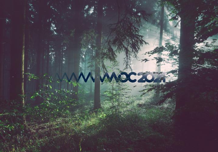
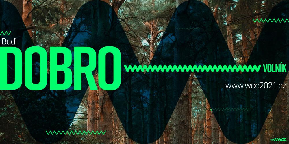
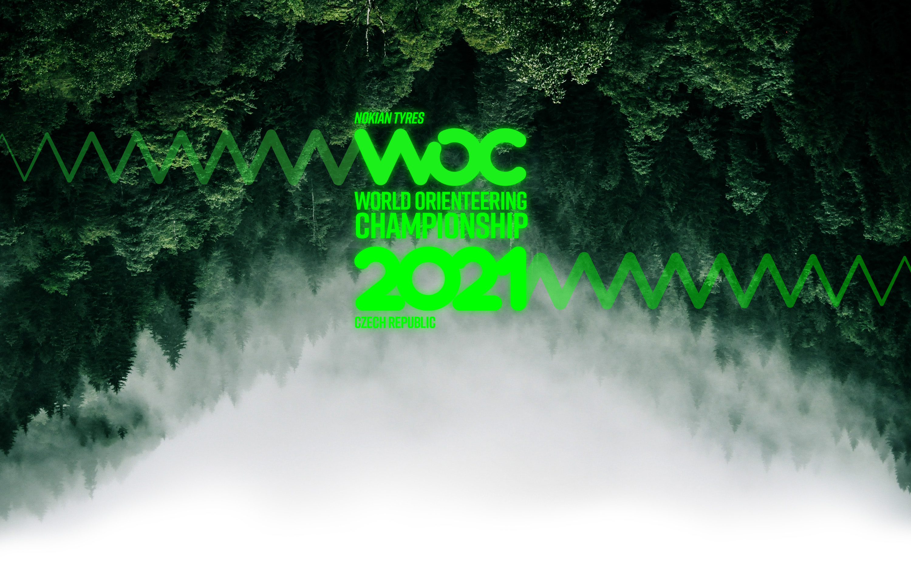
It has started back in the 2018 when the organisational committee approached me to create brand identity for upcoming WOC2021 and events that lead to it. I've created couple of concepts to go with the main tagline 'Back to the roots' and the claim that it'll be the most eco friendly orienteering event to this date.
From the beginning I knew that there'll be many people working with the brand so it was vital for its coherence to choose a graphical elements that are easy to reproduce, memorable and hardly anyone will compose it into wrong place or shape.
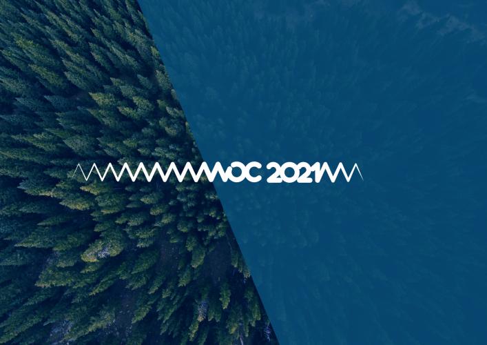
The main element - the wavy line that easily visually connects to the horizon of the forest, wild GPS tracker, runner looking for a direction as well as heart beat of a racer. With the smooth transformation into custom type WOC that is rounded and could be almost drawn by one line it became the building stone of the whole brand. Bright green color pallet to further demonstrate the energy of nature and eco minded event was accompanied by white and dark blue to create enough variety for any material digital or printed.
The main library of photos consisted of clean forest photos and videos. With support of local institutions, there was also a large number of high quality photos from the event locations. Those became part of the brand from the get go.
My job further on was to keep developing new use cases of the brand and keep the philosophy through the media.
Motion graphics
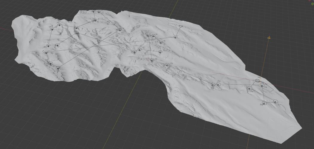
Together with the brand new look there was a need to develop a new way how to demonstrate intricate characteristics of orienteering and its main attraction. For that purpose I've developed 3D setup that consisted of 3D terrain with route choices animated to show the options for the runner to choose from control to control. That interluded with real footage from the location to demonstrate the connection between the map, 3D preview and the actual terrain. My orienteering background has very much shown vital for finishing this project with technical precision that will make sense for both orienteering and non-orienteering viewers.
Course Previews Breakdown
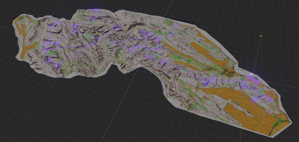
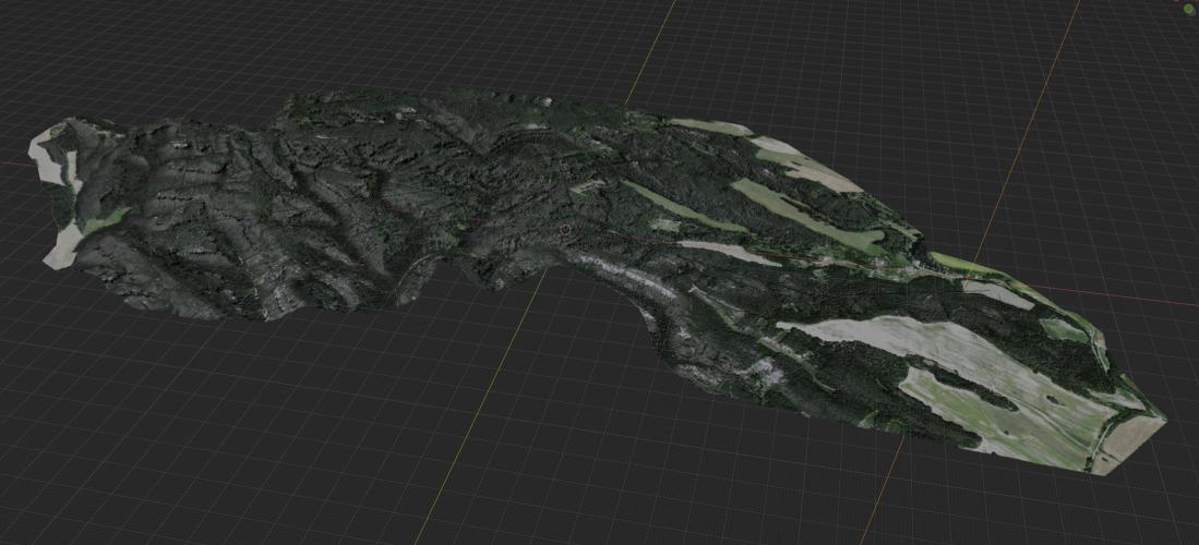
As a long term Blender user I was not hesitating to use it to bring my vision of the 3D visualization to life for the 3D parts of the course preview. Thanks to help from orienteering community I've been able to get .fbx file out of laser scan of the terrain used by the team creating maps. Retexturing and lighting it properly was crucial to get the tactile feel of a map and organic structure of a forest for the aerial photo texture. The transition between them made by custom shader was also a nice addition to further explain the relationship of a map and the terrain. Everything was composited in After Effects where the real life footage got a 'compass gizmo' that showed exact position on the map with the current route choice. All these features being world's first for orienteering. The tight timeline caused by last minute changes in the courses and understandable secrecy has been challenging and did not permit too much extra R&D time.
Videos
The last responsibility that I got hold of was to create something to commemorate the WOC2021 events by. For that I put together a crew of wonderful and enthusiastic filmmakers to help me create a series of 'After movies' from each day (all with a 24h turnaround) and one large After movie that will summarise World Orienteering Championships 2021 as a whole. Bringing back sweet memories and serving as a great tool for all our partners that has supported the event.
Video Breakdown
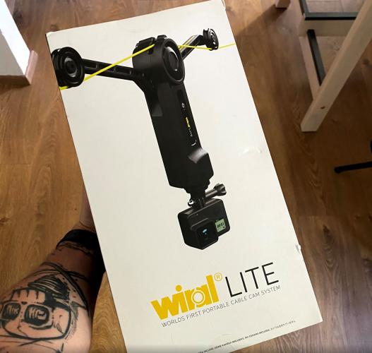
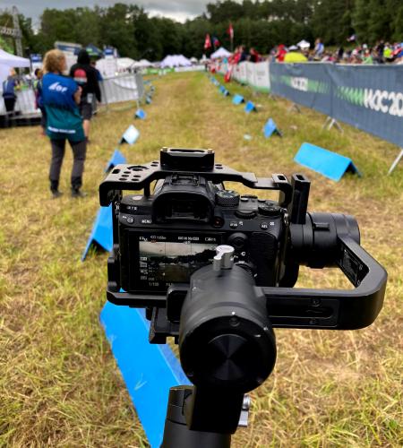
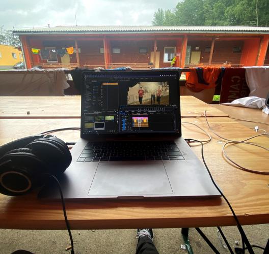
Apart from usage of the heavily CGI TV package that was made before hand, everything was done within 24 hours from the end of the race. That said, it was a rather overkill when it comes to the number of cameras and gadgets. But all was in the name of exploration to find new unseen angles and techniques to capture orienteering and its beauty. At our disposition at one point was 2x BMPCC 4K/6K, 2x Sony A7III with gimbals, Sony A7II, Sony a6500, Sony a6300, GoPro Hero 9, Insta 360 2X on a wire-cam, DJI Mavic 2 and all that with huge variety of lenses and accessories. That was definitely world's first but brought couple of complications for such a fast turnaround - huge amount of data and vast variety of color profiles and codecs. Even though we were trying to tweak all the settings to similar looking output it wasn't an easy task to color grade the final piece to match perfectly under 24h. Editing on the go was a challenge with just notebooks at hand and spotty connection, but we managed to accomplish what we said out to do.
Video crew: Petr Hostaš, Jan Hubáček, Lev Seidl, Jan Čermák, Vojta Illner, Daniel Vandas, Vít Zakouřil, Matyáš Štrégl
Summary
The branding has shown as a very versatile and functional through the whole event and should stand the test of time against the upcoming events. There was a variety of content created by the fans and participants mimicking the wavy line to be the part of the brand. Thus creating very strong world class brand experience.
The creation of 60+ minutes of high quality video content in a tight timeline was definitely a challenge, nevertheless it has gotten a fair amount of positive feedback online and offline. It was my favorite extension of the brand and something that will stay here for years.
David Procházka
marketing director WOC2021
We're presenting modern and dynamic sport that happens to have ever changing environment with every race. To make the graphics work, it needs to be adaptable, sensitively put together for every use and artfully integrated. All that we got from studio __STROY. Thanks to them we are able to translate the unique aspects of our sport and events to the public through all kinds of media.
