
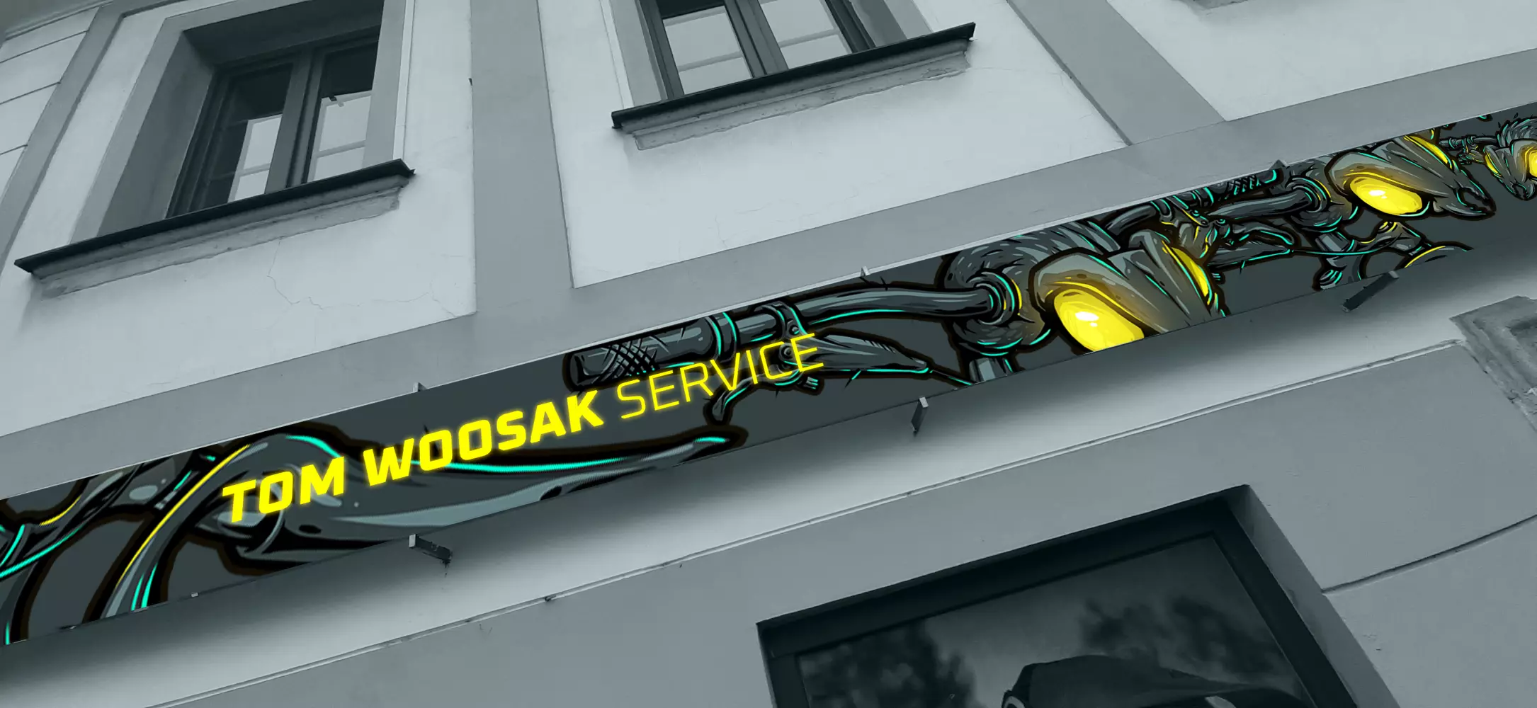
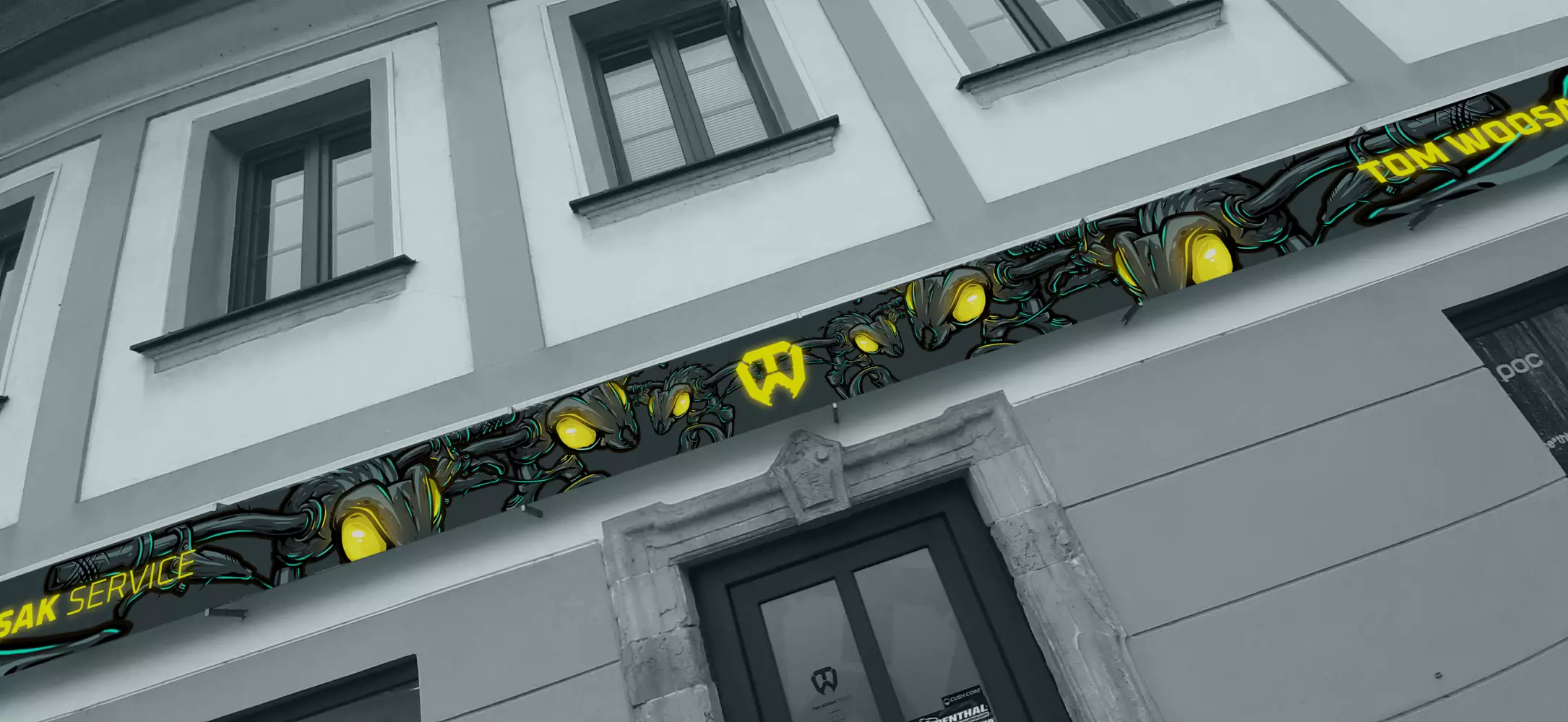
TOM WOOSAK
service
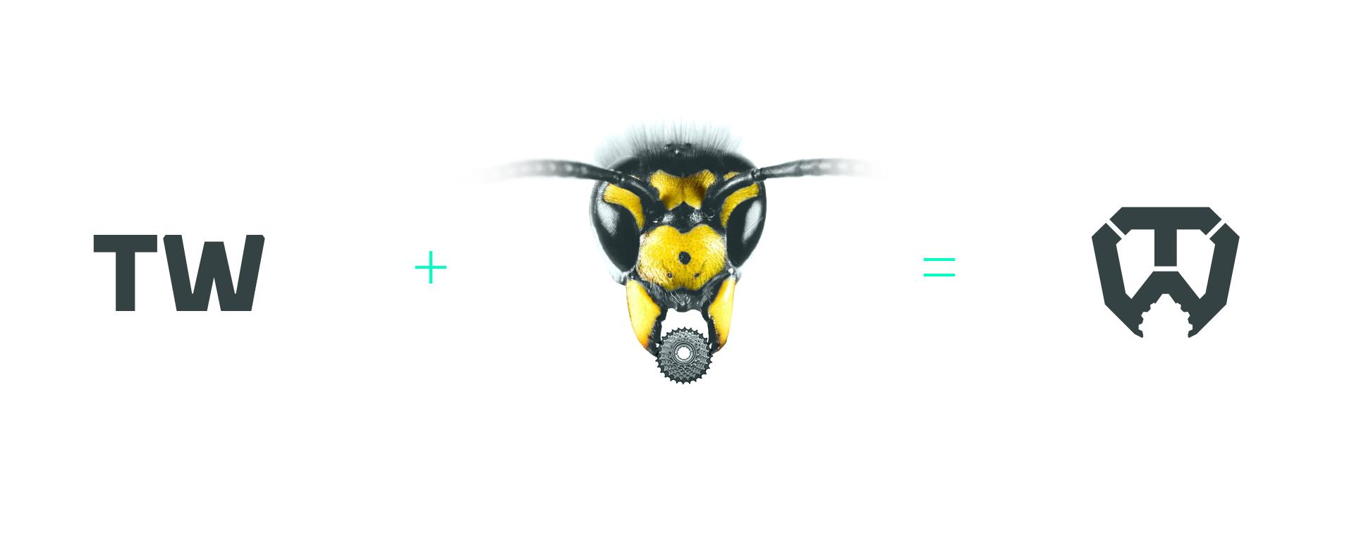
We really liked the logo for Woosak's bike service. The brand was created simply by combining the characters T+W into the shape of a wasp's head, the mandibles also have a small detail referring to the classic converter from the rear wheel.


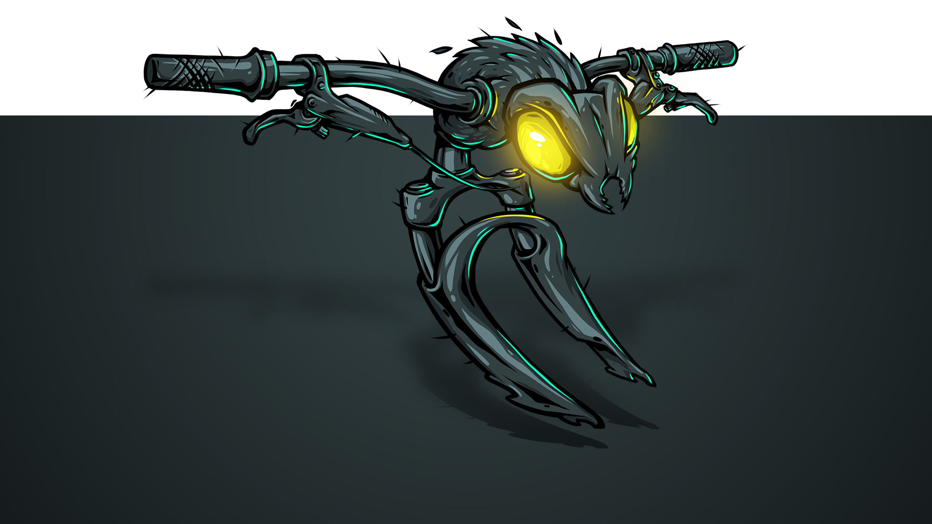
custom digital illustration
Other projects


