
Logotype
The logotype was created by connecting two symbols. The silhouette of Ještěd (Perret Prize, Construction of the Century in the Czech Republic) represents important buildings in the Liberec region and the prize itself doc. Ing. arch. Karel Hubáček, Dr. h. c.. Hard to ignore this unique symbol that connects all the themes encountered in the competition. The second symbol is an asterisk, which in classical symbolism means birth, the beginning. The competition maps new buildings that appeal with their architecture and new approaches. At the same time, it gives pupils, students and new talents a chance to excel. Everyone would like to see another new, perhaps smaller, but equally smart, reincarnated Ještěd born in our region.


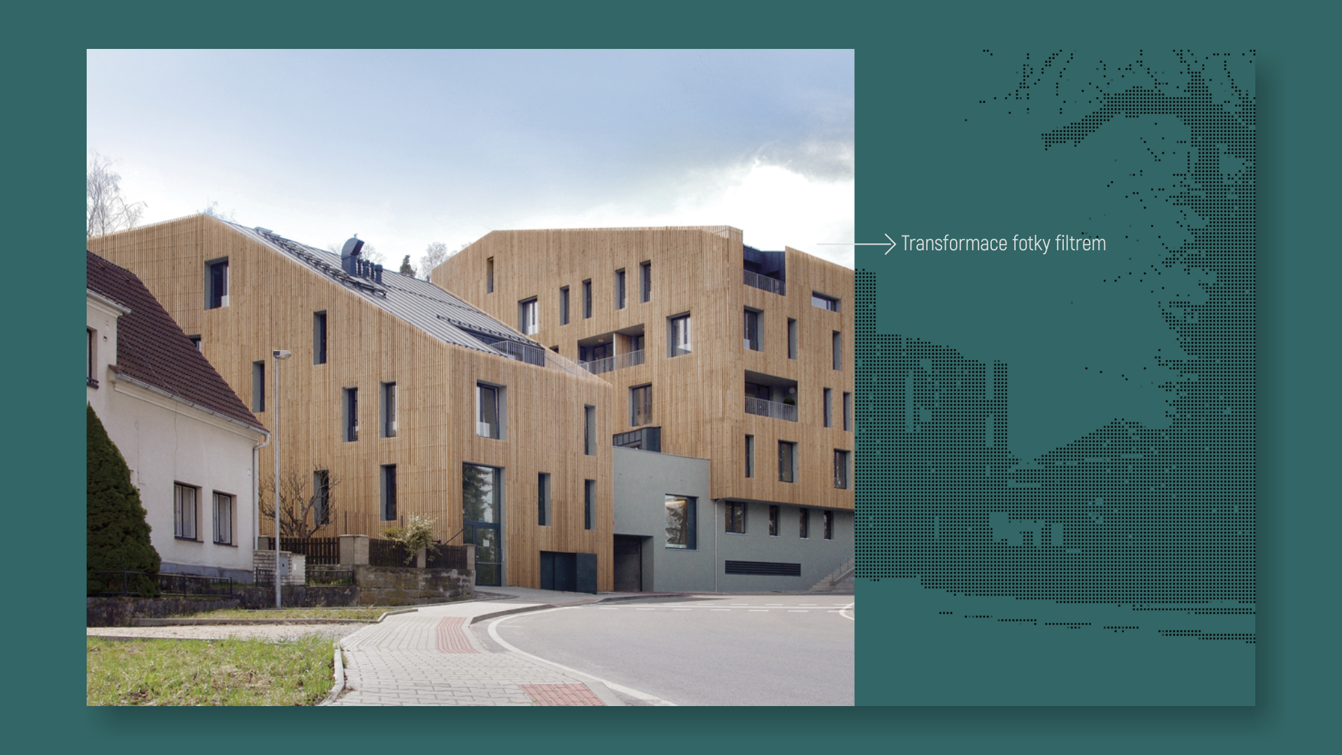
We created a unique photo filter for the website, which creates the aesthetics of the site and is further used in the identity. The movement of the elements itself complements the aesthetics.
Accompanying identity
The identity is based on the fact that the main part of the content will be photos of competing projects. The basis is a square grid that is based on the photo. The photo is edited into black and white - then a grid is placed over the photo to separate the individual pixels. Finally, blending the multiply style gives the base moss green color. Pattern thus creates a significant background graphic for each photo, which gently complements the image.
Moss green and black are earthy dull colors and do not overpower the main content - photos that can have a different range of colors.
iconography

Other projects


