

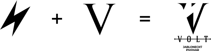
Logotype
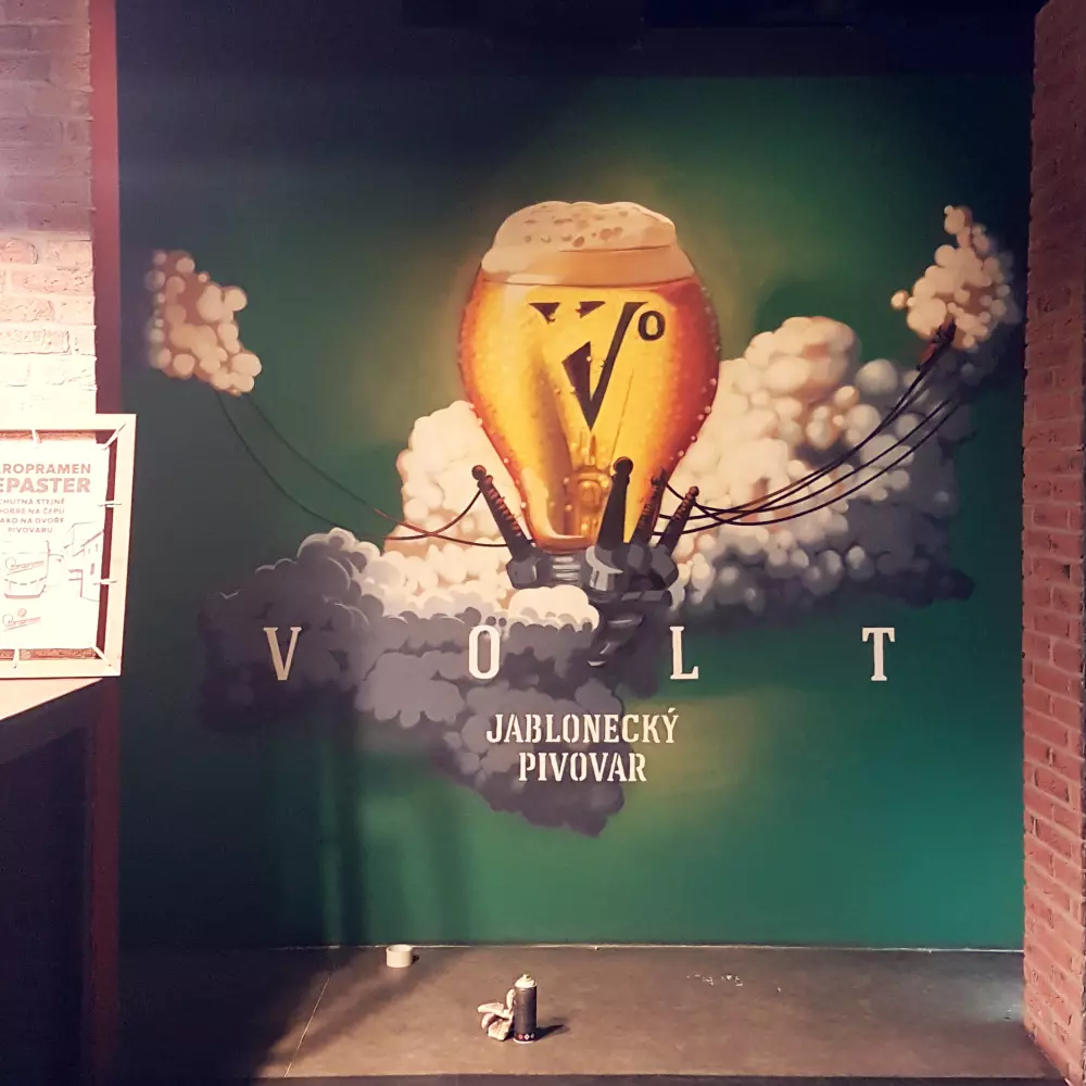
Like the target group, the Volta logo combines two generations. Lightning in the negative space represents youth, fun and energy, on the other hand "V" dressed in a serif font, refers to tradition, experience and stability. These two opposite sides meet in the logo just like the different generations of beer fans in the Volt.

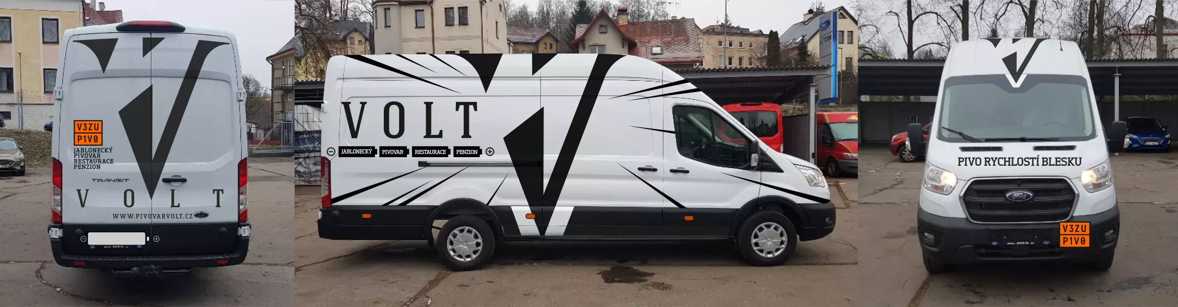
Identity
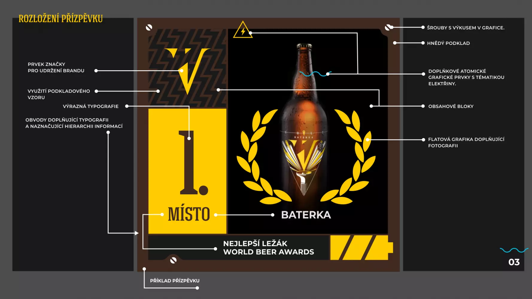
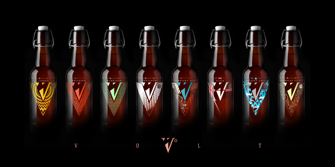
The basic color scheme is based on safety signs, which are typical visibility for electricity and energy. The basis is vector graphics, which can be easily applied to a wide range of applications. For graphics, collage and work with double meaning is typical, which is mainly manifested in the presentation of individual beers

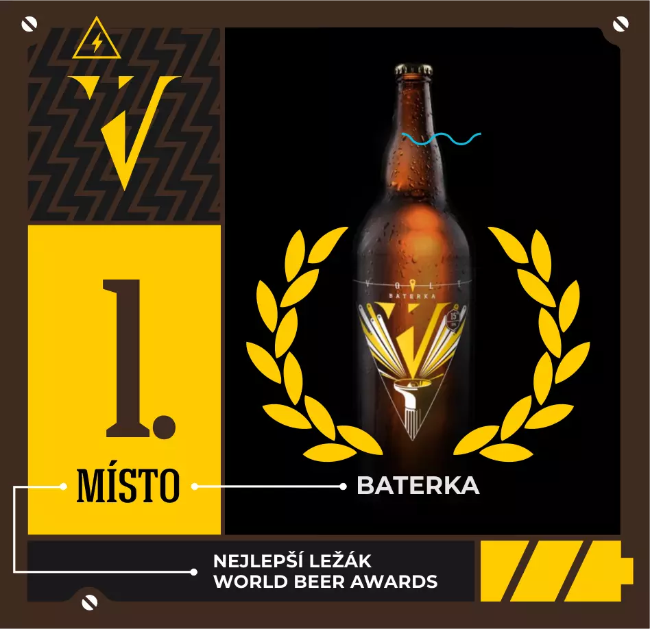
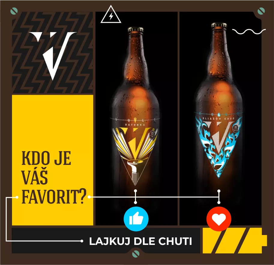


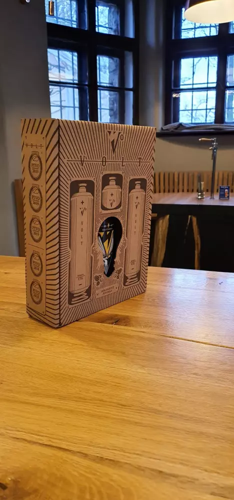
Labels and packaging
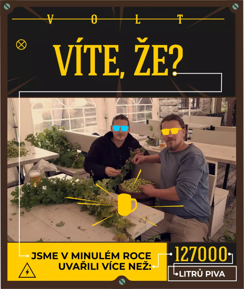
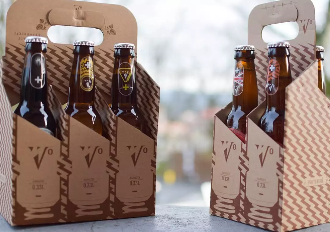
The visual labels complement the names themselves, which we choose according to the electronic components. Each electronic component has a very abstract function for uninitiated people, which they tried to describe by their name with various associations. We put them in a double meaning and further enhance them with illustrations. The brewery has brewed over 40 types of beer so far. As packaging, we use raw cardboard with printing and a secondary function as coasters, which, among other things, won the Packaging of the Year 2020.


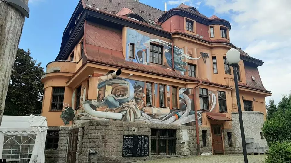
Paintings for the brewery
The brewery building located by the Jablonecka Reservoir (otherwise known as the Jablonecka Sea) got a new look in the form of Volta the diver and 2 electric eels. Furthermore, advertising for the company was painted for customers of Volta.
Other projects


