

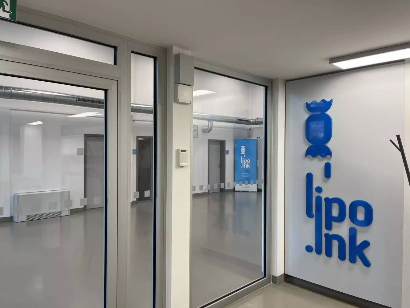
Logotype
The basis of the logotype is a wrapped candy in Let. it follows the first letters of the typography so that the letters create acceleration lines behind the candy. These acceleration lines expressing movement are also the accompanying morphology of the entire identity.
Wrapped candy is a symbol of something you want to unwrap and reveal the surprise that is hidden inside. The candy itself predetermines that it will be something good that people look forward to. In the same way, the projects that will apply to the incubator should be a positive surprise and innovation. The candy symbol further works with the claim:

which with its double meaning underlines the essence of the Incubator - to help small and medium-sized entrepreneurs, students to develop their specific innovative ideas and bring them to a competitive stage on the market.
Acceleration lines created from typography then describe the significant and rapid development typical of today's start-ups and represent the incubator as an institution that will help entrepreneurs and students to accelerate development and market entry. The combination of flying candy and typography makes Lipo.ink a significant brand.


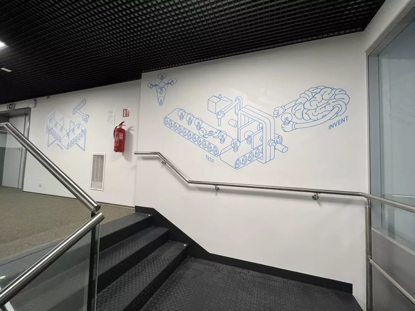
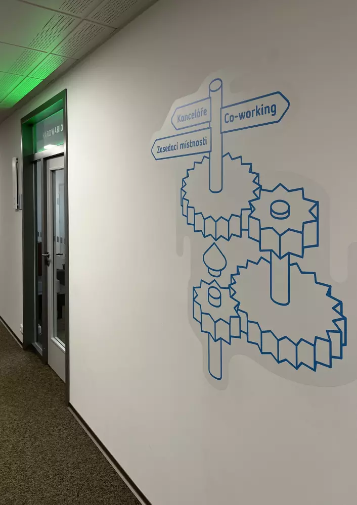
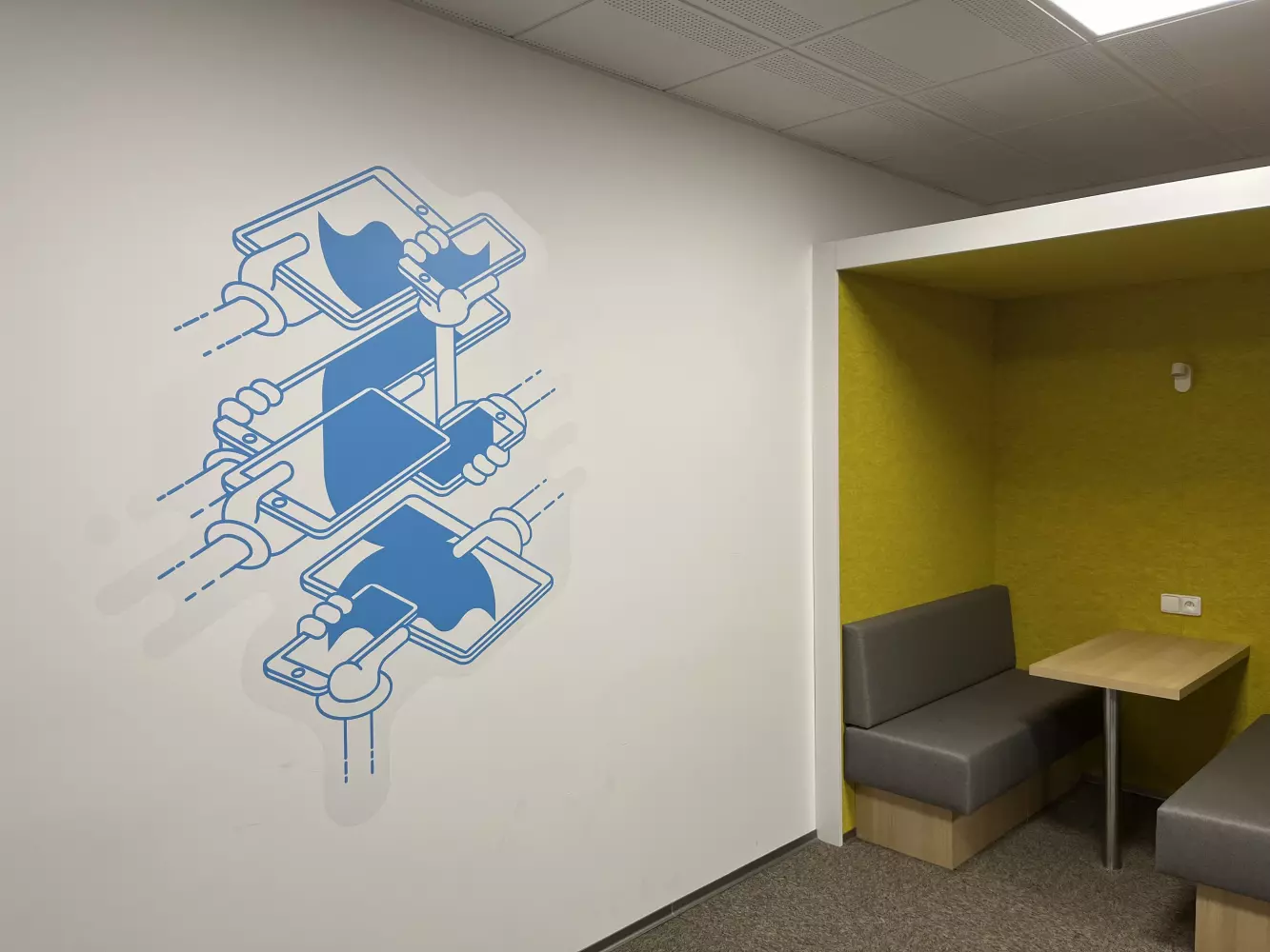
Illustration
We created illustrations for the incubator that describe the individual services of the institution, bring them closer to each other in a free form, and complement Lipa's friendly demeanor. They are used in individual materials, the web or in the interior of the building itself.


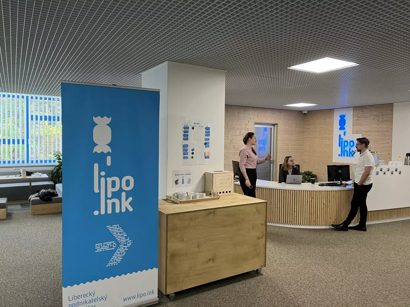
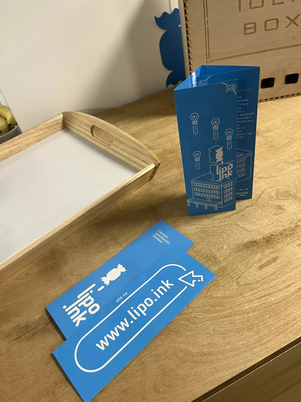
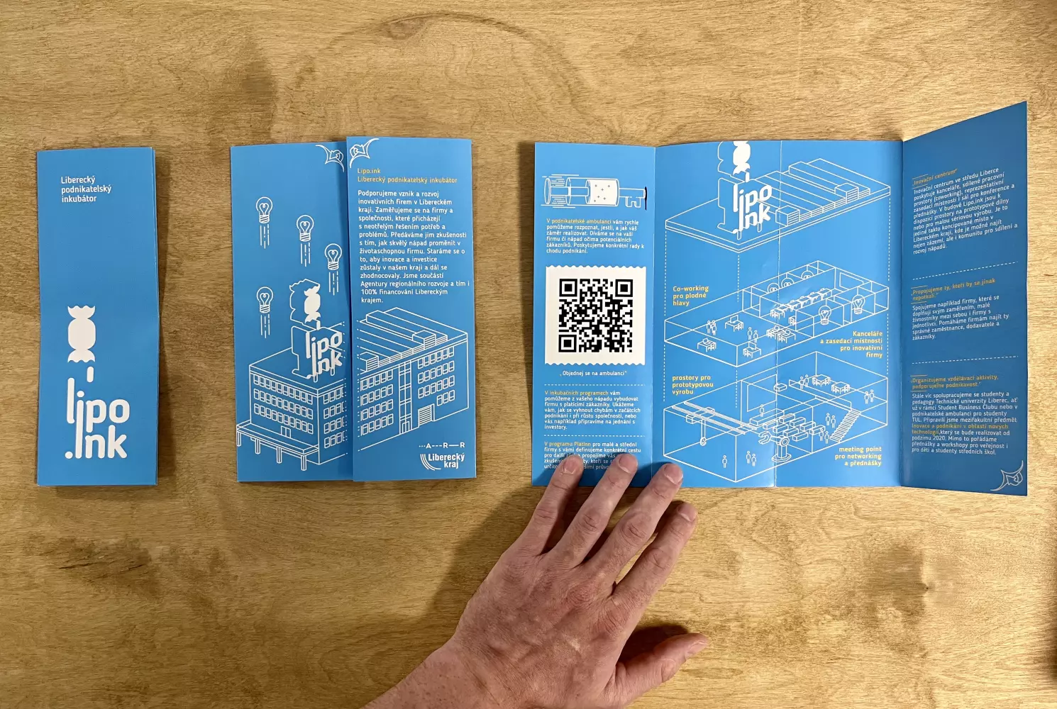
Practical use
Illustrations and other graphic elements are also used directly in the premises of the incubator and on the materials
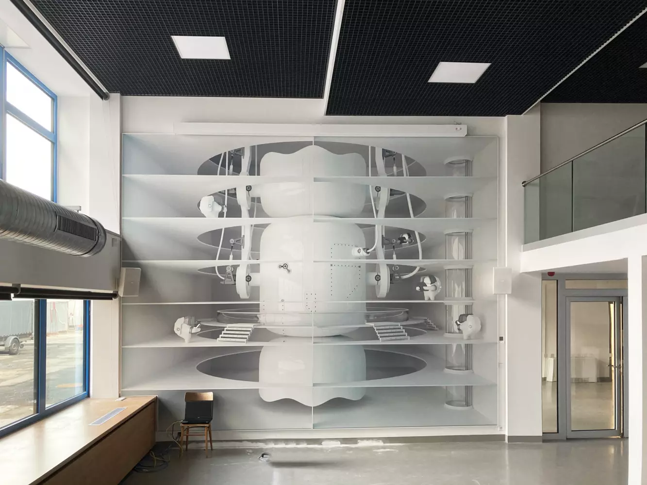


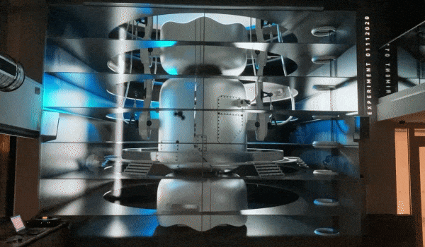
Mapping in the Meeting point
The meeting point, which is used for lectures and other social events, uses custom-made anamorphic printing and projection for lectures. In times of networking, when projection is not used for presentations, video mapping follows Lipa's activities. It uses a special mix of video mapping projected onto the print.


Other projects


